Introducing Pris

Allow me to tell you about my favorite time of the week. For the past six months, my oldest and I have embarked on an adventure every Saturday morning. When you’re three years old an adventure can be almost anything. For my son it is a 1.5 mile hike to the playground. For me it is two hours of father-son time—mixed with a little app testing.
The app I tested is my new camera app called Pris, and you’re gonna love it.
What is Pris?
Pris is a mobile camera app with a user interface built for capturing the moment. It’s on sale with a special launch price of $2, so go buy it now.
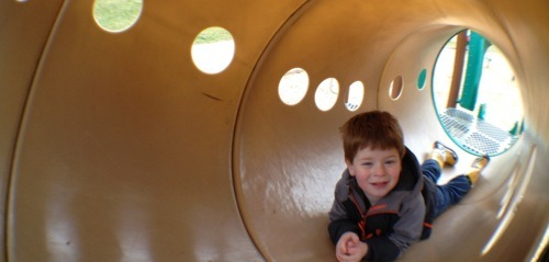
(all photos taken with Pris, some processed in Instagram)
Simple Design
When you first launch Pris, you’ll notice a few things different from your standard camera app. First, no tiny shutter button. Instead you take photos in Pris by tapping the screen. The design dedicates a full two-thirds of available screen real estate to its most important function. Since you can’t feel controls on a touchscreen—only see them!—your fingers will not develop a muscle memory. That means each time you want to take a picture, you have to look at the shutter button.
Pris is built so you can take pictures and videos without glancing away from what you’re trying to capture. This means you’re more likely to take the picture you intended. It’s faster because you’re not searching for a button.

Unique
The second thing you’ll notice, looking at Pris, is that the viewfinder is cropped. This is because the resulting image (or video) is cropped. When held vertically neé, portrait, Pris shoots a lovely square (1:1) photo ready to import directly into Instagram. Tilt Pris on its side—i.e., landscape—and the viewfinder changes to a cinematic widescreen. This crop gives you simple one-shot photo panoramas, but it gets really interesting when you switch into video mode.
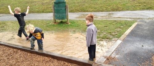
Made For Cinema
Pris is made for serious movie-making on the go. A tiny control, the toggle switch, is replaced with something larger. Just swipe right anywhere in the bottom third of the screen to switch into video mode.
Since I was little, I’ve been fascinated by cinema and the art of making movies. The wide 16:9 aspect ratio on the iPhone was nice, but I wanted something closer to the frame of my favorites movies: Star Wars, Bladerunner and 2001: A Space Odyssey1. These were all filmed in a wider 2.35:1 aspect ratio sometimes called CinemaScope.
I wanted to do something special for Pris, so I chose this aspect ratio to crop photos and videos in landscape. The resulting videos possess more grandeur and more drama than the made-for-HDTV movies shot with the standard iPhone settings.
Made for Photographers
It’s no secret that I’m a camera enthusiast and Pris was made with photographers in mind. There’s an increased creative control you get from Pris’ quick focus and exposure lock system. The realtime luminosity histogram is useful for checking your exposure before snapping the frame.
Most of all, Pris promotes two important parts of the photographic process: Composition and Selection. Most photography apps focus on post-processing a presumably sub-par image. I wanted to build an app that would improve the images you capture with the phone. Composition aids, such as the aforementioned creative mode and the live histogram, will help improve the technical quality of your photographs. Photos are stored internally, instead of your global Photo Album. Pick your absolute best and send only those to your photo album. Over time Photos.app will become the app you launch to show people your favorite images.

Beautiful Software
Pris continues my journey to deliver simple, fun software for creative people to do creative things. I’ve used Pris in every situation that presented itself, from the weekly walks with my oldest son to my youngest son’s first birthday. It’s important that I trust Pris with my most precious memories before I hand it over to capture yours.
Pris dons the moniker: Made in the USA. There is a strong US arts & crafts movement that aims to promote handcrafted over mass manufactured goods. It’s my hope that Pris and other apps like it bear “Made in the USA” to exemplify a standard of quality craftsmanship.
I hope you enjoy using Pris as much as I’ve enjoyed building it.
Who made Pris?
I designed the app and wrote all of the code, but I hardly built Pris by myself.
The Pris icon was designed by the talented Nick Keppol, our senior designer at MartianCraft. I didn’t want to steer far from the canonical camera icon, but I did want it to stand out. The glass and chrome of the white iPhone was an obvious inspiration for Nick. He also designed more legible reticules for the focus and exposure locks. A big shout-out also to Christopher Harrington, my Creative Director at MartianCraft. In addition to design guidance, he offered his radio voice to earlier versions of the app when I included a startup video tutorial.
Speaking of graphics, the entire user interface was designed and drawn in Gus Mueller’s excellent Acorn. One evening, I went to launch Photoshop while on an airplane. After it tried to phone home and refused to launch, I fired up Acorn and never looked back. A nice touch is that each layer style effect maps directly to CoreImage and CoreGraphics, so I could mockup exactly how it’d look. Acorn launches fast and runs without slowdown alongside Xcode on my first generation 11” MacBook Air.
I would be remiss if I did not thank my excellent beta testing team. They tested the app through its many wrinkles and warts, while providing excellent feedback and guidance. Some of them, like Jose and Mark tested every version of the app I distributed going back to October. Thank you Craig, Chris, John, Dan, Jason, Justin, Neven, Guy, Brandon, Steve, Jake and Mike; you’re the best.
Finally, (underscore) David Smith poked, prodded, and harassed me for eight long months. Everyday asking, where’s my build? If it was not for his encouragement, I would never have shipped.
Please Enjoy
Pris is having a launch sale today, 50% off on the App Store.
-
Only 35mm prints of the film were 2.35:1, it was filmed in 2:20:1. ↩